Why Your Brand Comes Across as Outdated (And How to Fix It)
Introduction
In healthcare and academic industry, reputation is built on years of rigorous work, groundbreaking research, and dedicated patient care. But what happens when the visual identity doesn’t reflect that excellence? A groundbreaking medical practice using a logo from the 90s or a pioneering research department with a website that’s impossible to navigate on a phone sends an immediate, and often unintentional, message: outdated, unprofessional, or out of touch.
First impressions are made in seconds. Before a potential patient reads your credentials or a funding body reviews your proposal, they see your brand. If that brand looks neglected, it can erode trust and undermine the very impact you work so hard to create. Let us explore the signs that your brand might be stuck in the past, and why these sectors are particularly vulnerable, and how you can build a modern visual identity that truly represents the quality of your work.
1. The Risk of having an Outdated Brand
An outdated brand tells the story before you ever say a word. Visuals like an old-fashioned logo, a clunky website that isn’t user-friendly, or an inconsistent color palette send a powerful, and often negative, message. It can suggest that your organization is behind the times, unprofessional, or disconnected from the modern world.
This risk is especially potent in fields built on credibility. In healthcare, a patient encountering a dated website may subconsciously question whether the medical practices are equally outmoded, which can quickly erode the trust essential for their care. In academia, a research institution with a stale visual identity can struggle to attract top talent, secure collaborations, or win competitive funding from partners who are looking to invest in forward-thinking innovation, not institutional stagnation.
2. Signs Your Brand Is Stuck in the Past
A few tell-tale signs can reveal if your visual identity is failing to keep up. Pay close attention to these common red flags and the negative message they send:
3. Why This Happens More in Healthcare and Academia
Healthcare and academia are particularly prone to outdated branding due to a unique mix of cultural and structural challenges.
First, with tight budgets, resources are understandably prioritized for core functions like patient care, research, and education. Design and marketing are often seen as non-essential overhead, leaving them underfunded.
Second, decisions are frequently made by committee rather than by branding professionals. This process often leads to low-impact designs meant to appease multiple stakeholders, rather than a cohesive vision that connects with an audience.
Finally, a powerful sense of tradition and a fear of change create significant inertia. The mindset of “we’ve always done it this way” can stifle progress, making it difficult to champion a brand refresh, even when it’s desperately needed.
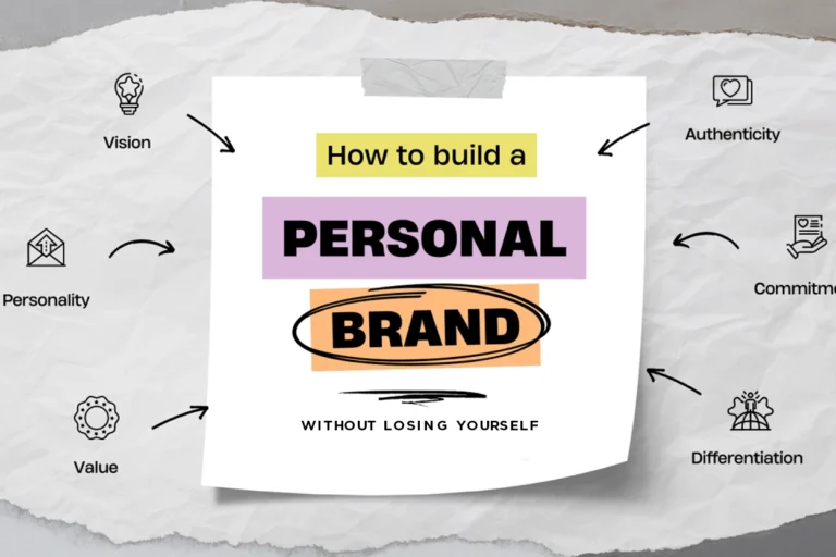
4. What Modern Branding Looks Like Today
Modern branding isn’t about chasing trends; it’s about building a credible, and consistent identity that connects with your audience. In healthcare and academia, an effective contemporary brand is built on a few core principles that communicate competence and care:
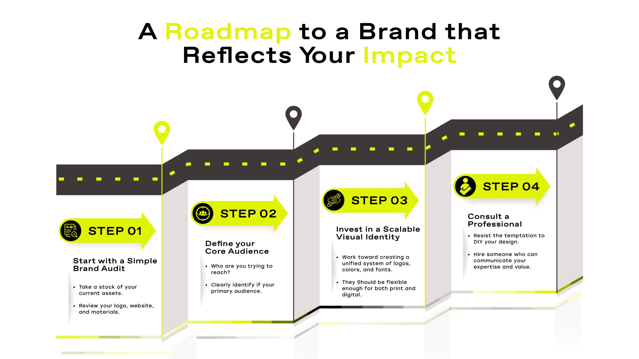
5. The Fix: A Roadmap to a Brand That Reflects Your Impact
Realigning your brand with your professional impact doesn’t have to be overwhelming. Follow this strategic roadmap to build a visual identity that works for you, not against you.
Step 1: Start with a Simple Brand Audit.
Begin by taking stock of your current assets. Review your logo, website, and materials to identify inconsistencies and weaknesses. This gives you a clear understanding of what needs to change.
Step 2: Define Your Core Audience.
Who are you trying to reach? Clearly identify if your primary audience is patients, peers, students, or funding bodies. Your brand’s voice and visuals must be tailored to resonate with them.
Step 3: Invest in a Scalable Visual Identity.
Work toward creating a unified system of logos, colors, and fonts that is flexible enough for all platforms from print to digital. This ensures consistency and allows your brand to evolve with you.
Step 4: Consult a Professional.
Resist the temptation to DIY your design. A professional who understands both strategy and aesthetics will ensure your new brand not only looks modern but also effectively communicates your expertise and value.
Conclusion:
An outdated brand creates a huge perception problem. It prevents you from connecting with the patients, partners, and peers who need you most. If your visual identity looks like it hasn’t been updated in ages, you’re missing a critical opportunity to build trust, persuade stakeholders, and grow your impact.
Wondering if your brand is still working for you? Take the first step toward modernization.
Take the Free Brand Health Check Quiz!
Answer a few simple questions to get an instant analysis of your brand’s strengths and weaknesses and find out if it’s time for an update.